
Storybook is an amazing tool, and you should use it if you’re thinking about starting a reusable component library for your project(s).
The Problem
All apps grow(if they’re successful) and quite often this means that it gets easier and easier for the code to become unmanageable. One of the parts that usually becomes a big ball of mud is the reusable component part.
While adding a new feature, you realize that you’re re-creating the same button for the 5th time. Same CSS, same HTML.
Good to know before jumping in
This article assumes some familiarity with Angular and Github Actions.
I’m not affiliated with StoryBook in any shape or form. This is my experience so far.
The Solution
Start a component library. Our library should fulfil the following requirements 👇
- Easy to maintain
- Easy to add new components to it
- Easy to visualize
- Easy to play with component inputs
- Bonus: Easy to test accessibility
- Bonus: Easy to test interactivity
- Bonus: Easy to do visual regression testing
Wait! Before you jump in and starting building all of this yourself( like any developer would do), have a look at Storybook. It seems to be a tool that ticks ✅ all of the boxes above. Let’s see how it performs and how easy it is to integrate in our Angular monorepo-ish.
Part 1 - Setup Storybook
This is where our journey starts. Our project structure looks like this right now:
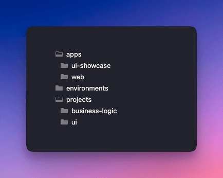
In our monorepo, we have 2 folders: one for apps and one for projects. (environments is purely for environment based configuration)
The 📁web folder is where our web client lives. The 📁business-logic folder is where our reusable logic lives(unimportant for this article). The 📁ui folder is where our reusable components live and the 📁ui-showcase is our old, hand-made, pain in the 🍑, difficult to maintain component library visualizer.
I tried to run npx storybook init (the easy way 😅). But the command failed...partially...and created some files here and there. Spent a bit of time to figure out what happened, but in the end I decided to go the manual way, to also understand better what is actually happening under the hood.
So, with this in mind, I started looking at some example repos, and search a bit through Github on how other people are doing this.
The .storybook folder
Here’s the first required part. You need a 📁.storybook folder where your Storybook configuration will live. Here’s the main.js file 👇️
We’re basically telling Storybook
- where to look for stories(I decided to colocate the stories with the reusable components, for easier maintainability)
- which add-ons to load(I use the default ones)
- which framework we’re using(Angular in this case)
- which builder should it use (webpack 5 in this case)
Next is the preview.js file 👇️
To my understanding, this bridges the communication between what compodoc generates and StoryBook. More on compodoc in a bit.
Next is the Typescript configuration in a tsconfig.json file 👇️
Here we’re telling the Typescript compiler which folders to scan(📁ui and 📁business-logic in our case). Ideally all models would be defined in the 📁ui folder, but right now, that's not the case. This is why we have to reference stuff from the 📁business-logic folder.
We also setup aliases for the 📁environments folder and for the 📁business-logic folder. This cleans-up our imports.
Last but not least, we exclude files that we don’t care about(.spec files in this case).
And here’s the typings.d.ts 👇️
This adds typings to .md imports. Not sure why this is needed.
The angular.json file
We also need to change our angular configuration to add a new application. This is what I had to add 👇️
This adds a new project to the angular-cli, tells which .tsconfig to use and loads the root styles needed throughout the 📁ui folder.
The package.json file
There are a couple of dev dependencies that need installing 👇️
On top of this, there are a few new commands we’ll need 👇️
These commands will help you run Storybook locally with npm run storybook and build for releasing with npm run build-storybook .
The tsconfig.app.json file
This is the configuration for out client(our 📁web folder in our case). In here, we have to tell the typescript compiler to ignore *.stories.ts files. This can be done by adding this: "exclude": ["**/*.stories.ts”] . That's it.
The .eslintrc.json file
As a tip, it’s worth adding the "plugin:storybook/recommended” to the extends part of your eslint configuration for some smarter linting. This will only care about linting Storybook stories(*.stories.ts files)
Part 2 - Our first reusable component
Just to see it working, here’s my ButtonComponent . It's a standalone component and the contents of it are not super important. We just need a component that we want to see in action.
button.component.ts 👇️
buttons.ts 👇️
button.component.scss 👇️
Again, this is not super important. You can use whatever component you want here. A component that you want to reuse.
Important though is to have a .stories.ts file next to it. This is where your stories will be defined, so Storybook knows what to do with it.
button.stories.ts 👇️
Here we created 4 stories, to show our button with 4 different configurations. Again, for more info on how to create stories, the Storybook Documentation is quite good.
Now, if you run npm run storybook this is what you'll get 👇️
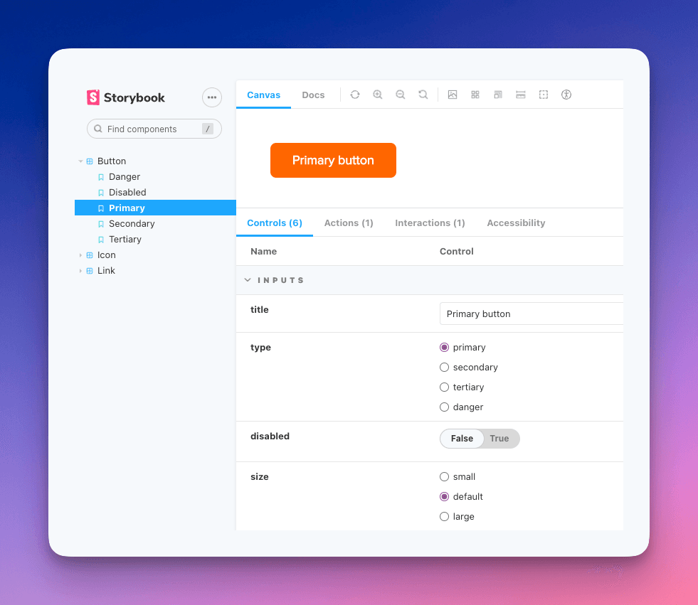
You can see our stories, all their inputs and you can play with all of that, change the text and see how our button will look/behave in different situations.
This is awesome! Basically, we are done fulfilling the first 4 points of our list.
Part 3 - Bonus stuff
Generic wrapper for all our components
We notice that the component is really up there, on the top left corner of our canvas. That’s not very pretty. We can easily setup a wrapper that will be used on all component stories and that wrapper will add some spacing. Here the new and improved preview.js on the 📁.storybook folder 👇️
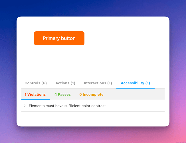
Add accessibility check
We can easily add an add-on that will flag if a component has accessibility issues. We can do this by installing @storybook/addon-a11y and adding that to the array of add-ons in the main.js file in the 📁.storybook folder. Now we can see that one of our buttons has an a11y issue 👇️
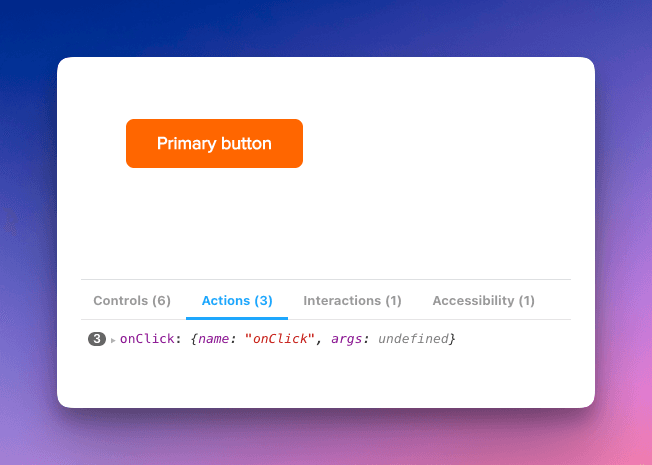
Add mock action handlers
We can also add a mock handler for events, to see when they happened. This is done by slightly changing our Template variable in the button.stories.ts file 👇️
After this, every time we click the button, we can see a log 👇️
Interaction tests
Adding an interaction test is also very simple. First, we need to install @storybook/test-runner .
Afterwards, we need a new command in package.json . Mine looks like this: "test-storybook": "test-storybook” .
Last but not least, we need to add the interaction in our stories. I added a simple interaction that tries to click the PrimaryButton in the buttons.stories.ts file 👇️
Visual regression testing
This is a cool one! Storybook works great with Chromatic. By integrating these two, you can publish your Storybook library, you can visualize your builds and... 🥁🥁🥁 You get alerted when there's a visual regression 🎉.
In order to add it you need a few things:
- An account(has a very generous free tier)
- Install the
chromaticpackage - Add a new command in your
package.json. Mine looks like this:"chromatic": "npx chromatic --project-token={my-project-id}” - Add a new Github Action. My
/.github/workflows/chromatic.ymlfile looks like this 👇️
This is just what works for me. For you, it could be completely different.
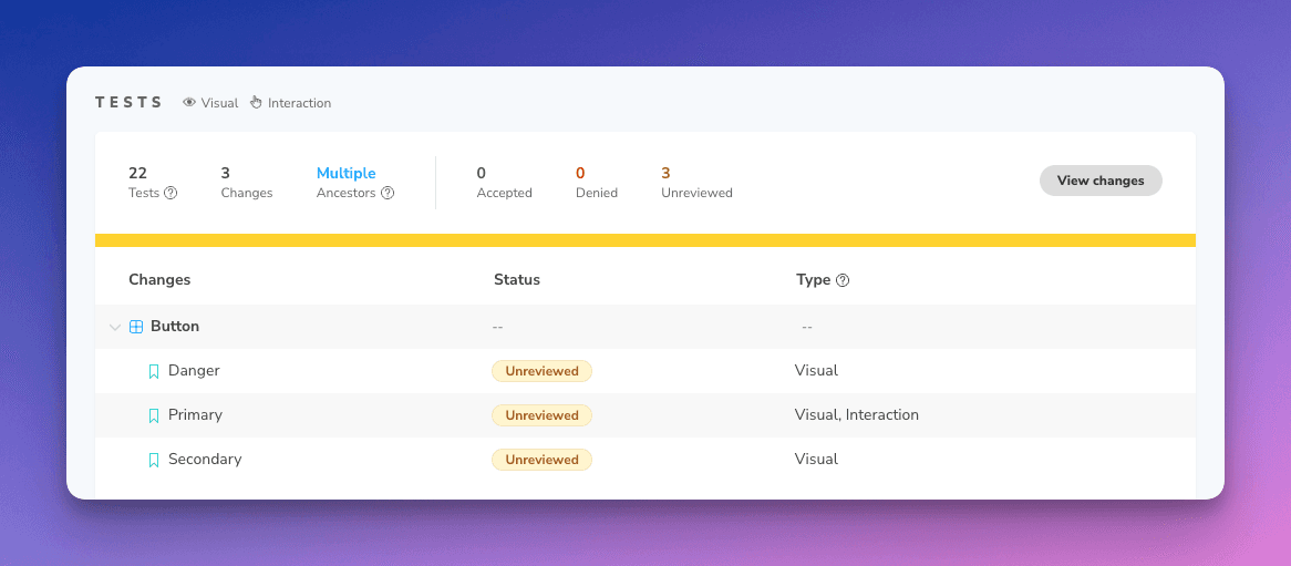
If you change the text color for the button and push, now you’ll see that the build needs approval 👇️
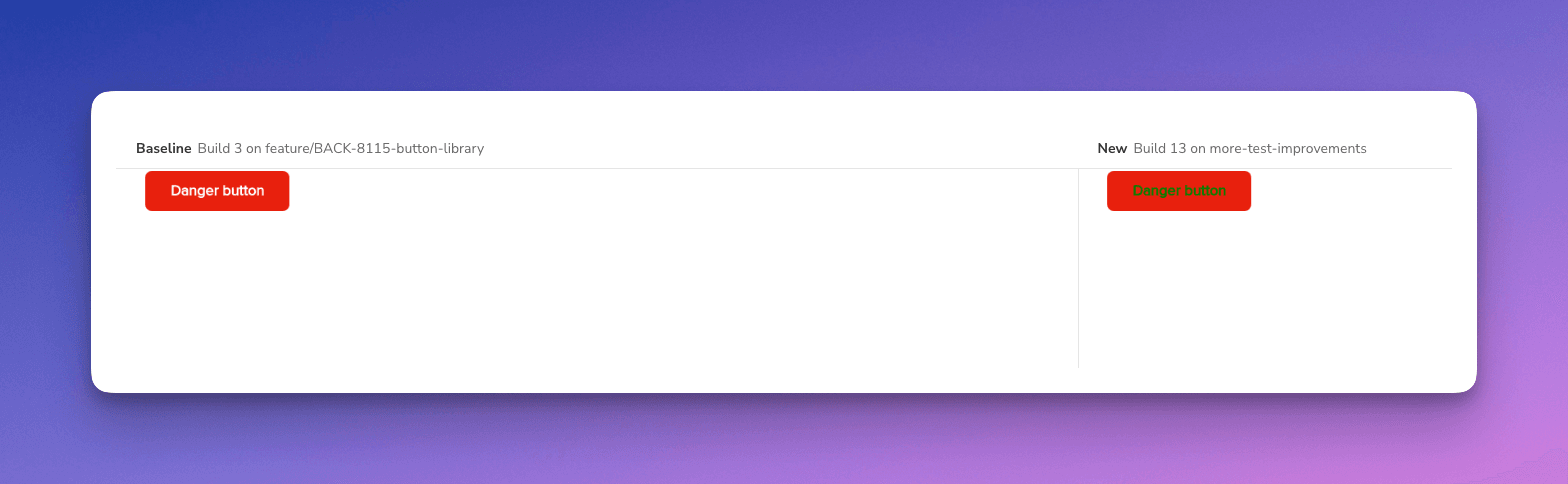
And you’ll see that what the difference is 👇️
Part 4 - Congrats
If you made it this far, congrats. This was a long one!
Want more?
If you want to know more about this, or something doesn't make any sense, please let me know.
Also, if you have questions, you know where to find me… On the internet!
Be kind to each other! 🧡
Over and out
How to add @Storybookjs and @chromaui to your #Angular repo. https://catalincodes.com/posts/how-to-add-storybook-to-angular #StoryBook #Chromatic