How to use CSS Subgrid to solve the problem around aligning content in different columns
The Problem
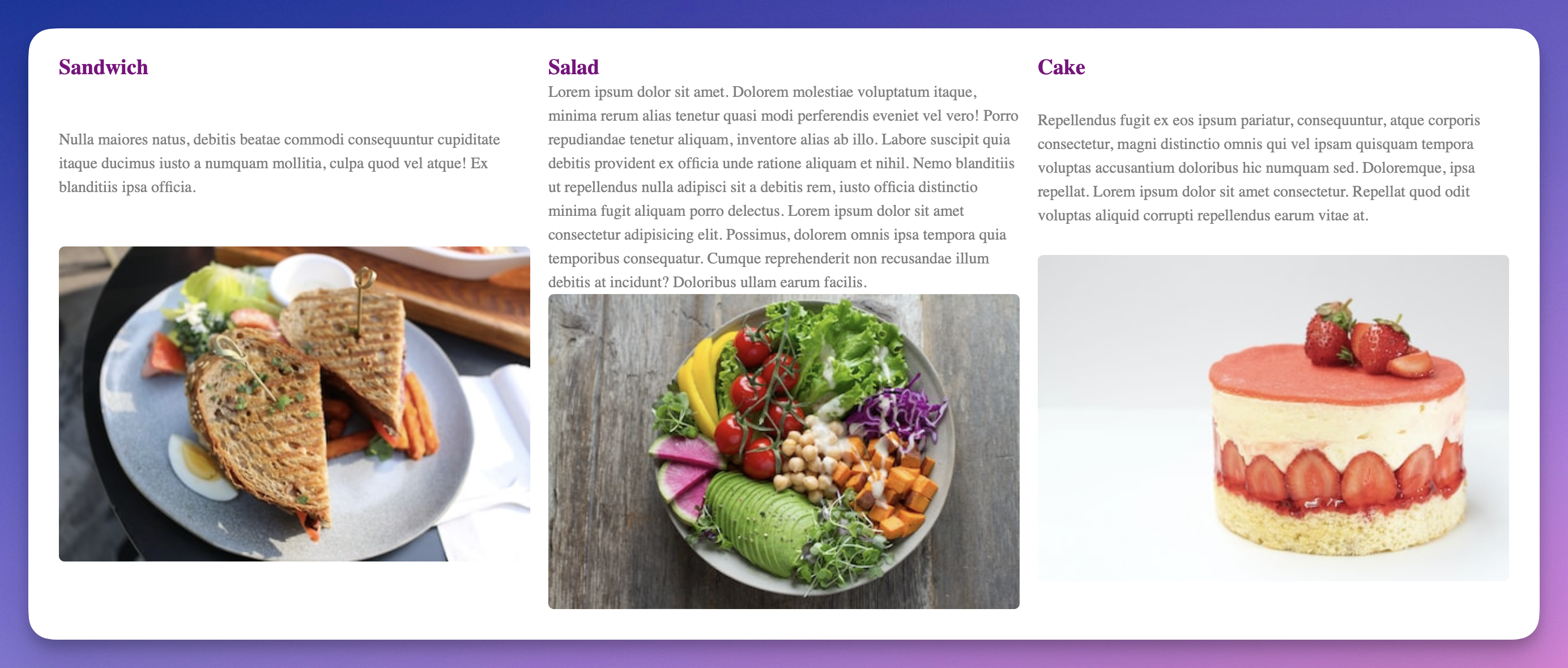
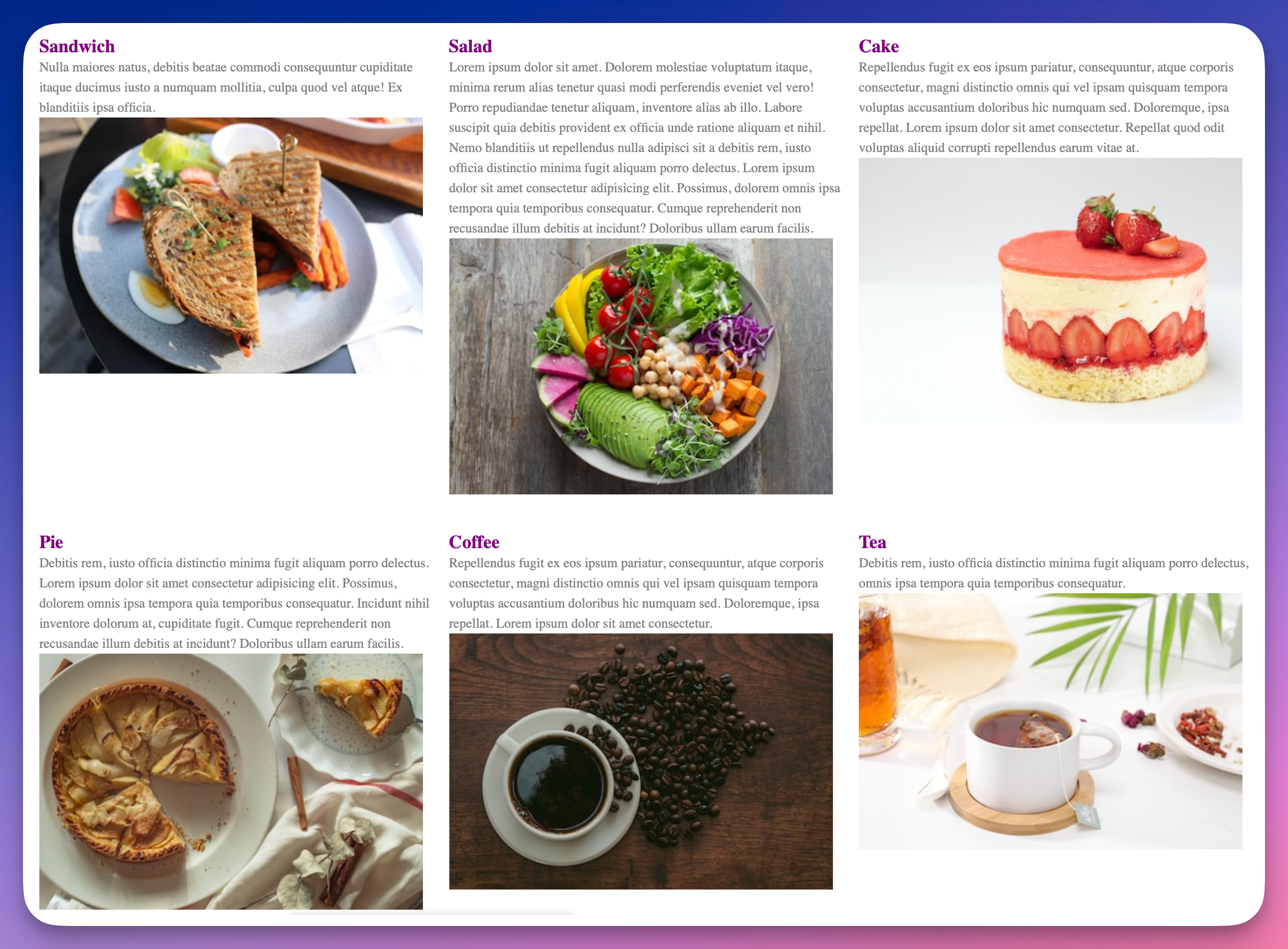
Sometimes, for example, while trying to build a UI for some USPs (Unique Selling Points) on your website, you run into a thorny problem. You have a couple of columns (dynamic number maybe) and in each column, you have a title, a description, and an image. Each description has a different height, and this results in your bottom image not being aligned. Would look something like this.
As you can see, because the height of the description block is variable, the image is not consistently aligned between columns. This might make your users hate you! Just kidding’ but they will cringe, though. 👎
Good to know
This article does not rely on any Javascript. The only thing you need to know is some basic CSS, and most importantly CSS Grid.
The Solution
The solution, as you can tell if you read the title (hopefully you did), is CSS Grid + Subgrid. We’ll split this in a few parts:
Initial HTML and CSS setup
How to use CSS Grid to distribute the columns on the available space
How to use CSS Subgrid to solve the aforementioned problem
Other stuff
Now, without further ado, let’s roll 🛞.
Part 1 – Initial setup
To illustrate this, we need a couple of columns. A column item contains a title, a description, and an image.
Here’s an example of one item 👇:
<article class="item">
	<h3>Sandwich</h3>
	<p>Nulla maiores natus, debitis beatae commodi consequuntur cupiditate itaque ducimus iusto a numquam mollitia, culpa quod vel atque! Ex blanditiis ipsa officia.
	</p>
	<img src="https://images.unsplash.com/photo-1517652792063-9c3118770d54?crop=entropy&cs=tinysrgb&fit=max&fm=jpg&ixid=MnwzMjM4NDZ8MHwxfHJhbmRvbXx8fHx8fHx8fDE2NzM4MzM4NTA&ixlib=rb-4.0.3&q=80&w=400" alt="Overhead shot of a grilled sandwich on a plate with garnishes. " title="Photo by Brandy S for Unsplash">

</article>
And here’s the HTML for putting a couple of them on the page 👇:
<section>
	<article class="item">
		<h3>Sandwich</h3>
		<p>Nulla maiores natus, debitis beatae commodi consequuntur cupiditate itaque ducimus iusto a numquam mollitia, culpa quod vel atque! Ex blanditiis ipsa officia.</p>
		<img src="https://images.unsplash.com/photo-1517652792063-9c3118770d54?crop=entropy&cs=tinysrgb&fit=max&fm=jpg&ixid=MnwzMjM4NDZ8MHwxfHJhbmRvbXx8fHx8fHx8fDE2NzM4MzM4NTA&ixlib=rb-4.0.3&q=80&w=400" alt="Overhead shot of a grilled sandwich on a plate with garnishes. " title="Photo by Brandy S for Unsplash">

	</article>
	<article class="item">
		<h3>Salad</h3>
		<p>Lorem ipsum dolor sit amet. Dolorem molestiae voluptatum itaque, minima rerum alias tenetur quasi modi perferendis eveniet vel vero! Porro repudiandae tenetur aliquam, inventore alias ab illo. Labore suscipit quia debitis provident ex officia unde ratione aliquam et nihil. Nemo blanditiis ut repellendus nulla adipisci sit a debitis rem, iusto officia distinctio minima fugit aliquam porro delectus. Lorem ipsum dolor sit amet consectetur adipisicing elit. Possimus, dolorem omnis ipsa tempora quia temporibus consequatur. Cumque reprehenderit non recusandae illum debitis at incidunt? Doloribus ullam earum facilis.</p>
		<img src="https://images.unsplash.com/photo-1512621776951-a57141f2eefd?crop=entropy&cs=tinysrgb&fit=max&fm=jpg&ixid=MnwzMjM4NDZ8MHwxfHJhbmRvbXx8fHx8fHx8fDE2NzM4MzM3NjQ&ixlib=rb-4.0.3&q=80&w=400" alt="Overhead photo of a salad bowl with a variety of raw vegetables. " title="Photo by Anna Pelzer for Unsplash">

	</article>
	<article class="item">
		<h3>Cake</h3>
		<p>Repellendus fugit ex eos ipsum pariatur, consequuntur, atque corporis consectetur, magni distinctio omnis qui vel ipsam quisquam tempora voluptas accusantium doloribus hic numquam sed. Doloremque, ipsa repellat. Lorem ipsum dolor sit amet consectetur. Repellat quod odit voluptas aliquid corrupti repellendus earum vitae at.</p>
		<img src="https://images.unsplash.com/photo-1611293388250-580b08c4a145?crop=entropy&cs=tinysrgb&fit=max&fm=jpg&ixid=MnwzMjM4NDZ8MHwxfHJhbmRvbXx8fHx8fHx8fDE2NzM4MzMzMTQ&ixlib=rb-4.0.3&q=80&w=400" alt="A strawberries and cream cake on a white background. " title="Photo by amirali mirhashemian for Unsplash">

	</article>
	<article class="item">
		<h3>Pie</h3>
		<p>Debitis rem, iusto officia distinctio minima fugit aliquam porro delectus. Lorem ipsum dolor sit amet consectetur adipisicing elit. Possimus, dolorem omnis ipsa tempora quia temporibus consequatur. Incidunt nihil inventore dolorum at, cupiditate fugit. Cumque reprehenderit non recusandae illum debitis at incidunt? Doloribus ullam earum facilis.</p>

		<img src="https://images.unsplash.com/photo-1562007908-859b4ba9a1a2?crop=entropy&cs=tinysrgb&fit=max&fm=jpg&ixid=MnwzMjM4NDZ8MHwxfHJhbmRvbXx8fHx8fHx8fDE2NzM4MzM0MDM&ixlib=rb-4.0.3&q=80&w=400" alt="An apple pie with a slice cut out and placed on a plate beside the pie dish. " title="Photo by Diliara Garifullina for Unsplash">
	</article>
	<article class="item">
		<h3>Coffee</h3>
		<p>Repellendus fugit ex eos ipsum pariatur, consequuntur, atque corporis consectetur, magni distinctio omnis qui vel ipsam quisquam tempora voluptas accusantium doloribus hic numquam sed. Doloremque, ipsa repellat. Lorem ipsum dolor sit amet consectetur.</p>
		<img src="https://images.unsplash.com/photo-1536227661368-deef57acf708?crop=entropy&cs=tinysrgb&fit=max&fm=jpg&ixid=MnwzMjM4NDZ8MHwxfHJhbmRvbXx8fHx8fHx8fDE2NzM4MzIwNzE&ixlib=rb-4.0.3&q=80&w=400" alt="Overhead photo of a cup of coffee on a saucer. Beside the cup is a scattered pile of coffee beans. " title="Photo by Julia Florczak for Unsplash">

	</article>
	<article class="item">
		<h3>Tea</h3>
		<p>Debitis rem, iusto officia distinctio minima fugit aliquam porro delectus, omnis ipsa tempora quia temporibus consequatur. </p>
		<img src="https://images.unsplash.com/photo-1597318181409-cf64d0b5d8a2?crop=entropy&cs=tinysrgb&fit=max&fm=jpg&ixid=MnwzMjM4NDZ8MHwxfHJhbmRvbXx8fHx8fHx8fDE2NzM4MzIxOTM&ixlib=rb-4.0.3&q=80&w=400" alt="A steeping cup of tea on a wooden coaster." title="Photo by TeaCora Rooibos for Unsplash">

	</article>
</section>
Basically, we have multiple items, inside a section. Let’s quickly add some basic CSS to make this ok-ish 👇.
img {
	display: block;
	width: 100%;
	border-radius: 5px;
}

p,
h3 {
	margin-block: 0;
}

p {
	line-height: 1.5;
	font-size: 0.875rem;
	color: grey;
}

h3 {
	margin-block-start: 1em;
	color: purple;
}
Let’s see how it looks.
I was joking. It still looks horrible 😅.
Part 2 – Use CSS Grid for basic layout
With the basic setup in place, let’s use CSS Grid to properly distribute our columns.
Here’s what to add to our CSS 👇:
Let’s break this down.
First, we add display: grid; to tell our container to use the grid layout mode.
Next, we’re giving instructions about our columns: grid-template-columns: repeat(auto-fit, minmax(350px, 1fr)). Basically, fit as many columns as you can on each row. A column should be minimum 350px, and maximum the full available space.
After this, we do something similar for our rows: grid-template-rows: repeat(auto-fit, auto);. Fit as many rows as you can. Each row should take the needed space. This way, we’re not constraining our rows to be a specific height. They’ll adapt based on the needed space.
Lastly, for some cosmetic improvement, we add some spacing with grid-gap: 1rem.
After these changes, our UI looks slightly better.
And here, our problem appears. While everything looks decent, you can see that our images are not aligned. This is not ideal.
Part 3 – Use CSS Subgrid to solve the problem
Now, for the magic part 🪄. We’ll update our CSS to use CSS Subgrid to align our rows within each column. Here’s how we’ll do it 👇:
.item {
	grid-row: span 3;
	display: grid;
	grid-template-rows: subgrid;
}
First, we tell each item to span across 3 rows (since it has 3 bits of content) with grid-row: span 3;
Afterward, the .item itself should use CSS Grid as a Layout mode with display: grid.
Finally… 🥁, we’re telling all the rows in this newly created grid, to align with the rows of the parent grid grid-template-rows: subgrid;. Because in the parent grid we defined the rows to take as much space as needed, this will make sure that all rows are the same height, which is the height of the tallest row.
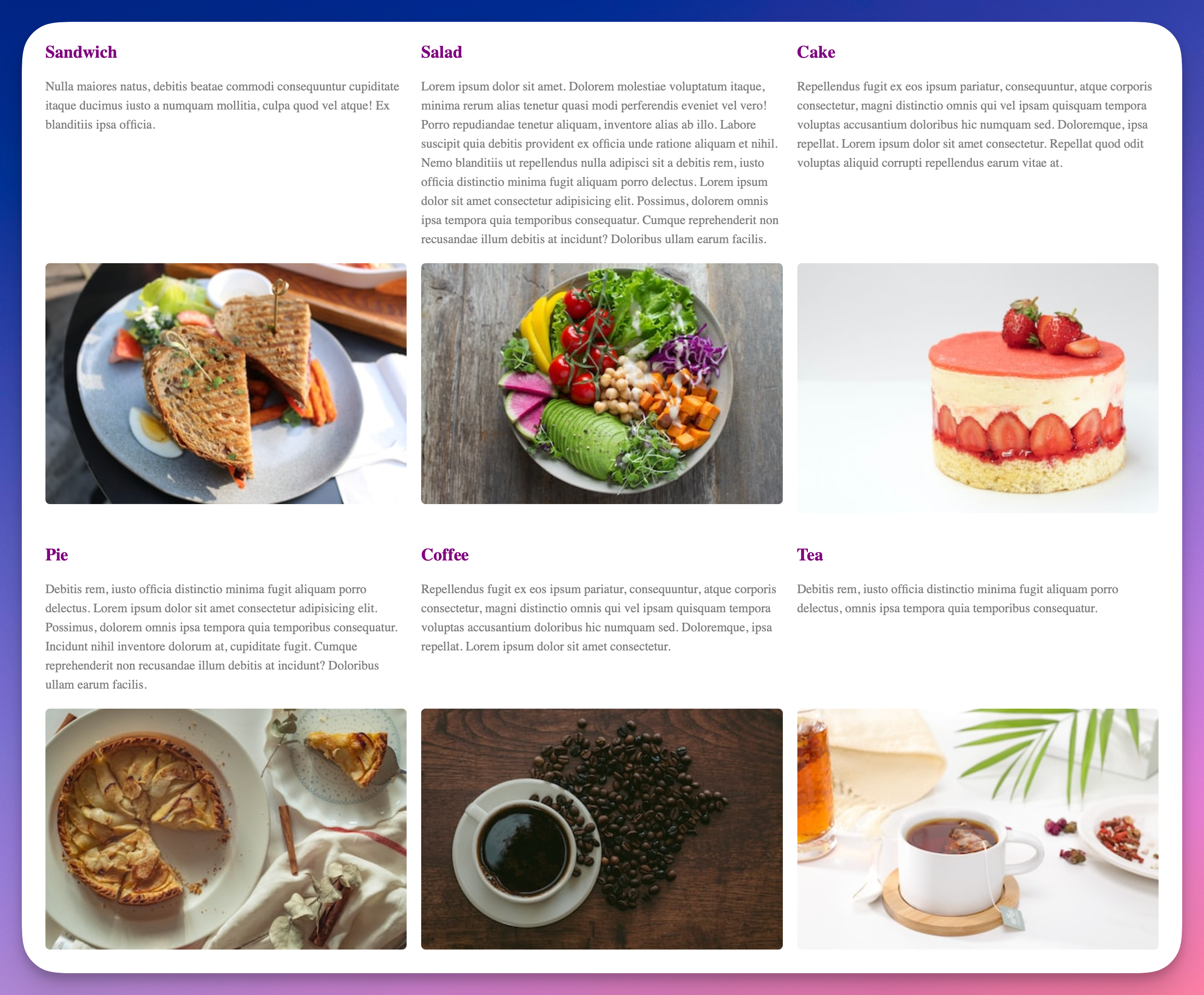
Here’s how our updated design looks now:
Perfect alignment. Isn’t this great? 🤩
Part 4 – Other stuff
First, there’s a ton of other improvements we can make from here. Maybe centre the text vertically, perhaps add ellipsis(...) after 3 rows or so, to make sure we don’t get massive blocks of text, possibly use a better font etc. But it was not about this. This article was meant to simply show one of the problems that CSS Subgrid helps solve.
I’m sure there are other ways to solve this problem. That’s perfectly fine.
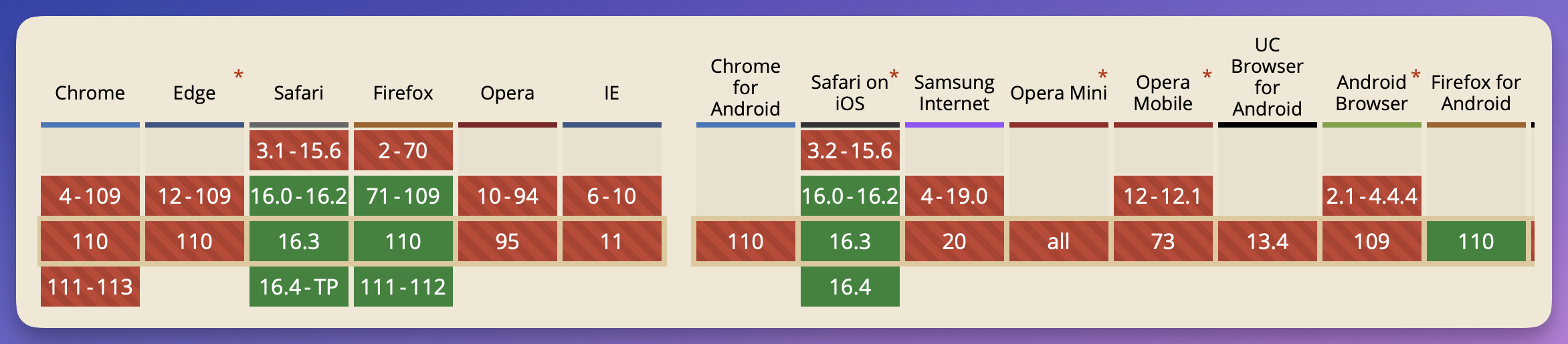
CSS Subgrid support is not great. Here’s how it looks at the time of writing this article:
Basically, Safari and Firefox work, but Chrome, for some reason, is lagging. We’re on the right track, though.
This article uses resources from a tutorial by Ahmad Shadeed's "Learn CSS Subgrid" which I highly recommend trying.
Congrats 🎉
You made it yet through another article. Thanks for spending the time reading this, and hope it provided some sort of value, since time is a limited resource. Use it wisely. 🙏
Want more?
If you want to know more about this, or something doesn't make any sense, please let me know.
Also, if you have questions, you know where to find me… On the internet!
