
One of many. The toggle element is an often needed element in front end development, and this is how I built it.
The Problem
Frequently, in front end development, we require a toggle. We want to show the state of a specific setting, preference, and we wish to allow the user to turn the thing ON/OFF. While checkboxes work for this (input type="checkbox"), sometimes we want something prettier, something that better reflects the ON/OFF state. Enter, the TOGGLE.
Good to know
This example is built using Angular, but any framework would have a similar approach. The important bits here are the HTML and the CSS.
The Solution
Here’s how this article is divided:
AngularBoilerplateHTMLSetup- Make it pretty a.k.a. Step by Step
CSSexplanation.
Here we go 🏎️.
Part 1 – Angular Boilerplate
Again, feel free to ignore this part, or adapt it to whatever framework you intend to use. Here’s what I ended up with:
Nothing special here. It’s a standalone component, with an empty (for now) template, and 3 inputs: the name of the control, the value, and the disabled state.
We also have an Output, which is Angular’s way of bubbling up events from components. This one is being used to emit if the toggle is toggled.
Part 2 – The HTML
For the HTML, we know a couple of things:
- The component is the equivalent of a checkbox
- We need a label for the checkbox
- We need to make it accessible
So, with that in mind, let’s build the HTML. First, the shell:
This is where everywhere will be added. It’s a div that has a disabled class and when clicked, it triggers the above defined toggleValue() function. So far, so good.
Next, we need the checkbox:
Here we have a label and an input with type checkbox. We’re using the value and the disabled properties to set the input correctly.
We are also giving them the class of visually-hidden. This will be a utility class that will ensure something is not visible or intrusive for users who rely on a mouse and keyboard to navigate the interface. The purpose of these elements will be to help people who rely on accessibility features to navigate our interface.
I hope everything makes sense so far.
Looking at our UI, we need one element for the ball 🏀 inside the toggle. Here’s that:
The only special part here is that we’re giving it a CSS class of checked if the value property is true.
Here’s our complete HTML:
Part 3 – Make it pretty
Now the HTML is there, it all makes sense, but it’s just ugly 👇
Let’s start with the shell, the toggle CSS class. Here’s what I have:
A couple of things here. We’re giving the element a width and a height, some border-radius, and we’re centering the items vertically with align-items: center in a flexbox container.
Of course, we also want to transition the background-color. We want it pretty, right?
There are two more states for our Toggle: disabled, and checked. Here are our styles for those:
Long story short, if the Toggle element has a node with the class checked inside, then the background-color is changed to DodgerBlue. We know that we’ll apply a checked class to the circle 🏀 when the value is true, and here we’re using that CSS class to control the background-color of the parent.
When the Toggle is disabled, we decrease the opacity. That’s it.
What fun!
Next, the circle element:
We’re making sure it looks like a circle using the same width and height + border-radius. We’re giving it a bit of shadow, and we’re animating the transform property.
This, because when the element has the checked class, we’re moving the circle on the X-axis 22 pixels. That’s all about our animation.
Finally, the visually-hidden part:
Josh Comeau has an excellent article on how this works, and why. So, instead of botching the explanation, I’ll direct you to his article. Like mentioned above, it makes sure that elements are not intrusive, while being helpful to users who rely on assistive technologies.
So, with all this in place, our Toggle is final. Oh, what a journey.
I do hope all of this made sense and helped you get a more in-depth understanding of how everything fits together.
And again, this is just one way of building a Toggle. It’s not the best way, or the only way.
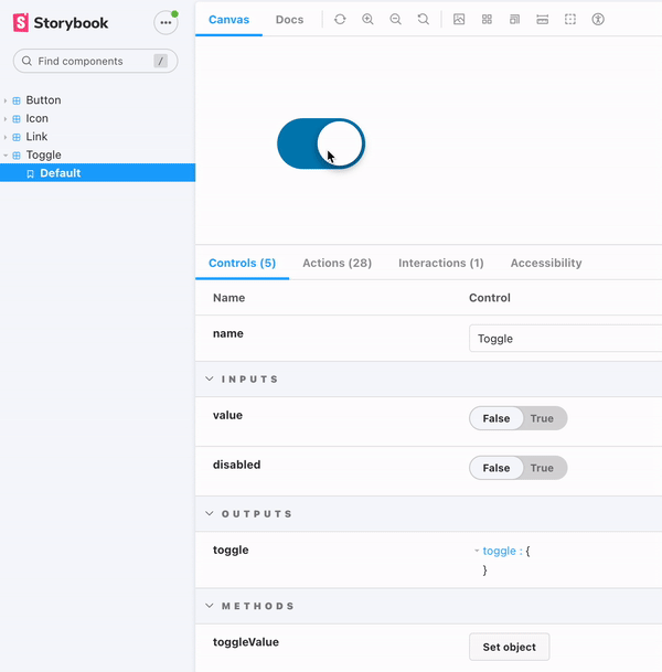
Here's the final result 👇
Congrats 🎉
You made it yet through another article. Thanks for spending the time reading this, and hope it provided some sort of value, since time is a limited resource. Use it wisely. 🙏
Want more?
If you want to know more about this, or something doesn't make any sense, please let me know.
Also, if you have questions, you know where to find me… On the internet!
Be kind to each other! 🧡
Over and out
🤓 I wrote a post about one way of building a Toggle element for your website. One of many 🚀: https://catalincodes.com/posts/one-way-of-building-a-toggle #HTML #CSS #UI