Make it pretty, animated, smooth and maintainable. Yes you can 💪.
The Problem
You were told that you have to build a Chat system into your app. Oh boy, the excitement. It’s a great challenge and you’re super pumped up to start working on it.
You see the designs, and they look awesome, however, the more you think about it, the more you start seeing the differences between Desktop and Mobile. No matter which framework you’re using, ideally, you would want to build the whole page once, and not have to switch components based on the screen width.
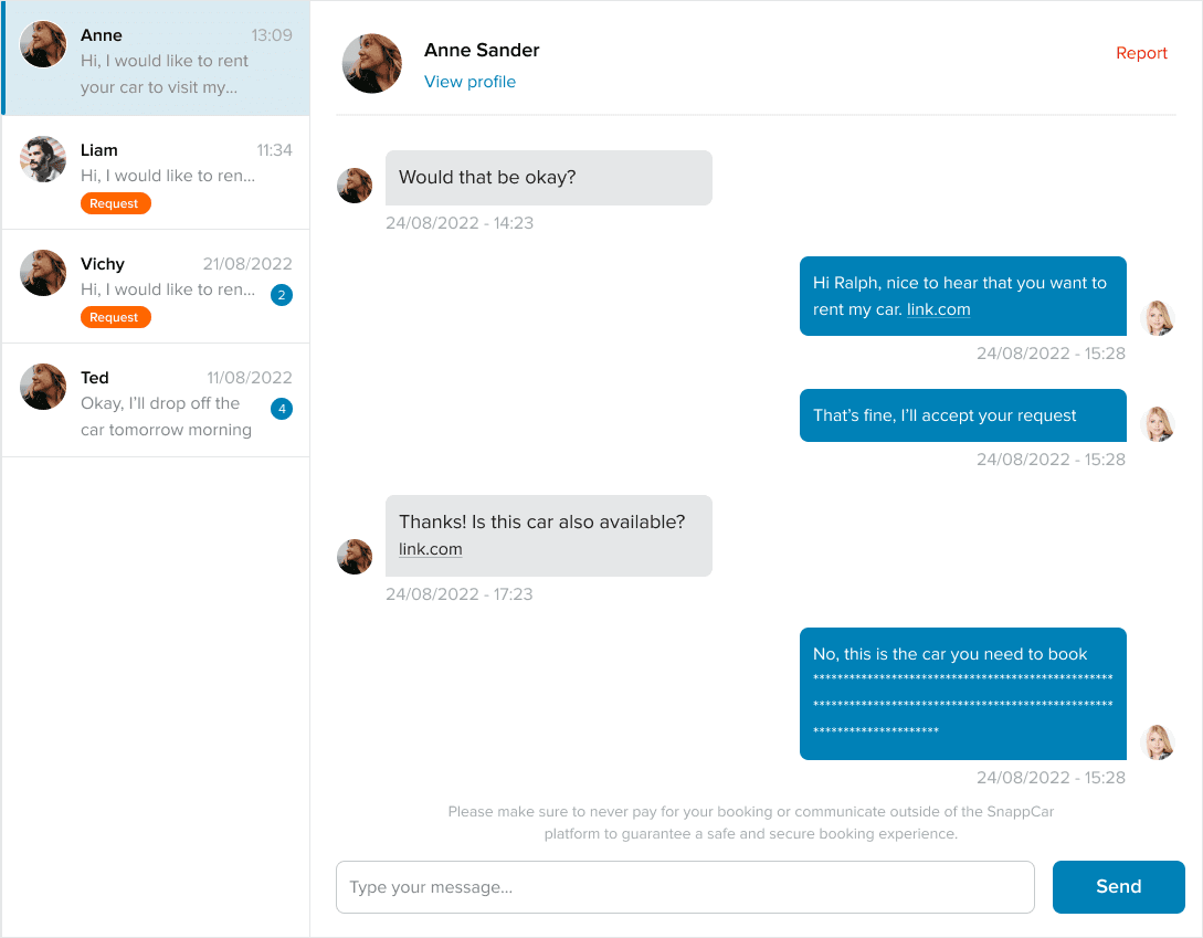
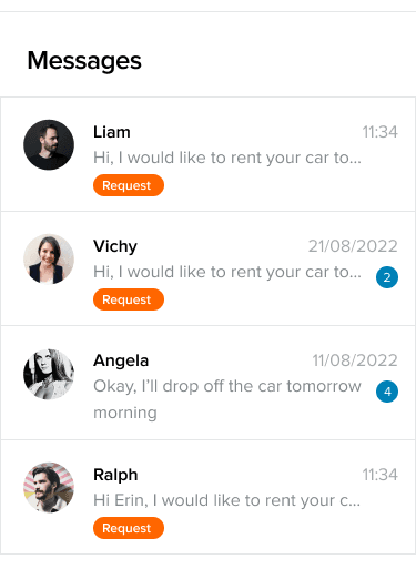
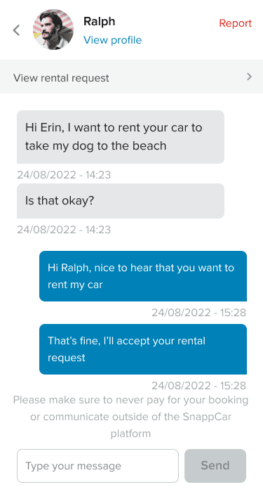
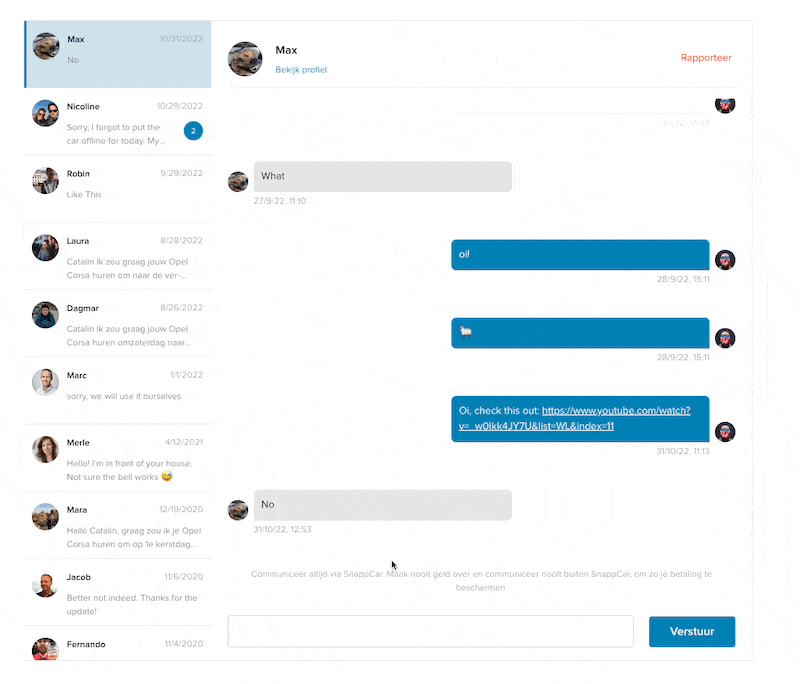
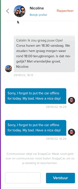
Here are some designs to inspire you:
We can do this.
Good to know before jumping in
This article is framework agnostic. You will need to be familiar with CSS Grid though.
The Solution
There a few parts to our solution:
- The HTML
- The CSS for Desktop
- The CSS for Mobile
- The animations
Part 1: The HTML
The HTML is pretty straight forward. We will setup a two column grid, with a couple of rows. On the left side we’ll have the Conversations, on the right side we’ll have the Messages in the selected conversation.
Could look something like this:
We have 3 main elements: an aside with the conversations, a header with details about the selected conversations and a section with all the chat messages in the selected conversation.
I’m not gonna go through with applying any cosmetic styling to this, since that’s not the point of the post, but feel free to check the CodePen here for a complete example with some cosmetic styling applied as well.
However, we do need some CSS for our layout.
Part 2: The Layout CSS for Desktop
Like mentioned somewhere above, we’re gonna use CSS Grid for this challenge. Here’s the first draft.
As you can see, we setup a Grid with 2 columns: 290px for the first one and the rest of the space for the second one. Same way, we setup 2 rows: first one will take as much as it needs, and the second one will take the rest of the space. We are also adding a gap of 1rem between all these elements.
Now, we want to make sure that our conversations and our messages(since there might be quite a few of them) do not expand into a huge element. This is why we lock the container to an arbitrary 500px height, and set the .conversations and .messages to be scrollable within the container.
Just by using this, we have a nice looking grid on almost all screens. However, this looks weird if you try to see it on a small screen. Let’s fix that.
Part 3: The Layout CSS for Mobile
I know, I know this is not Mobile first or anything, it just made it easier for me to think about it by building it like this. Feel free to flip this around into a mobile-first style.
So, in order to make this follow the design on mobile, we need somehow our grid to change from a 2 column grid, to a 1 column grid. Not only that, but we also need a way to alternate between what’s shown in the visible column: it could be the .conversations element OR the .messages element.
We also don’t want to have any horizontal scroll. Nobody likes that on mobile. Nobody.
Ok, first things first, let’s make our Grid adapt to a 1 column UI. This is what my solution turned out to be.
That was a trick question. We actually did not settle for a 1 column grid, but instead we made the grid have 2 columns, both have a width equal to the viewport width. This will come in handy when we will animate the transitions. For now, think about 2 equal columns, both taking the full viewport width. To make the grid not scrollable horizontally(since now there’s content there), we tell it overflow-x: hidden .
That’s about it when it comes to making the grid one column. We’re on the right track to make this amazing.
Part 4: The animations
Ok, now we have 2 columns, and we need to somehow allow the user to switch between them. We can do this with a combination of Javascript(for some buttons) and some CSS translations.
First we’ll write a small piece of JS that adds an extra class to our container based on the mode we’re in. We can be in .conversations-mode when the user sees only the conversations or in .messages-mode when the user sees only the messages in a conversation.
Here’s the code:
I know it’s not how you would write this, but this is not the point of the post. It gets the job done, we can improve it later. Here, we’re doing 2 things:
- If a user clicks on a conversation, we enable ConversationsMode by adding the
.conversations-modeclass and disable MessagesMode by removing the.messages-modeclass. - The opposite happens when the user clicks the back button. Important note here is that we display the back button only on Mobile. On Desktop it’s hidden(with
display: none)
Now, we have a way of styling elements based on the current Mode.
Let’s do that:
What we’re doing here is moving things in or out of the way. If we’re in ConversationsMode, we’re moving the Header and the Messages out of the way by translating them 100% on the horizontal axis.
If we get into MessagesMode, we translate the Messages and the Header into view, by translating them -100% on the horizontal axis. This way, they will replace the Conversations. But for this to work, we also need to move the Conversations out of the way. Same thing, we do this by translating them -100% on the horizontal axis.
We’re using translate for this, because that’s easy to animate.
The last part, the transitions.
This is the cherry 🍒 on top. Here, we tell the browser to animate the transform and the opacity with slightly different durations and timings. This way, the animations will look more natural and less “perfect”.
Remember: ease-in when something leaves the view and ease-out when something comes into view.
Final thoughts
After all this, hope most of it made sense and now you’re comfortable making a responsive and animated Chat UI with CSS Grid.
Again, if you want to see it in action, you can find a working CodePen here. If you make the rendering area smaller, you'll be able to see the transition between screens as well.
Also, here’s how it looks with a bit of styling. Both desktop and mobile view.
Want more?
If you want to know more about this, or something doesn't make any sense, please let me know.
Also, if you have questions, you know where to find me… On the internet!
Be kind to each other! 🧡
Over and out
If you ever need to implement a Chat UI with just CSS and HTML, with smooth transitions and without using 34 different components, I got you. https://catalincodes.com/posts/responsive-chat-with-css-grid #CSS #Grid #HTML